Fidelity Bank Plc Website Redesign

-

Web design for a commercial bank

Building a web experience that aids lifestyle banking

The Product:

Project Manager, Developer, UI/UX designer

I lead a team of experience/ interface designers, developers, project manager and product testers to deliver a fresh all in one website solution for the bank’s numerous products. We designed a total of over 120 unique web pages and several other auxiliary screens.

I lead a team of experience/ interface designers, developers, project manager and product testers to deliver a fresh all in one website solution for the bank’s numerous products. We designed a total of over 120 unique web pages and several other auxiliary screens.

Fidelity bank has

Background Research:

Methodological approach was taken to this non-linear design process.

Methodological approach was taken to this non-linear design process.

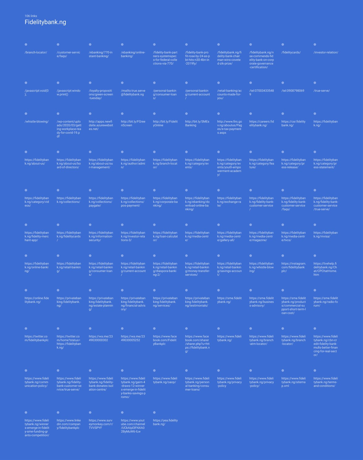
Fidelity Bank Plc commissioned the Emperors at EOC to provide a comprehensive and consolidated website redesign solution that would enable the bank stay spanking fresh & innovative, increase competitive advantage online, manage evolving customer expectations stemming from their recent rebrand and repositioning exercise. The website was to focus on ensuring that customers could access all they needed from the bank’s website easily, hereby reducing bounce rate and give a whole new feel to the bank’s brand.The project involved the redesign and development of all their business offerings from, Personal banking, SME banking, Corporate banking, Private banking to their corporate social responsibility efforts. 
The Problem:

From the research carried our, I discovered a problem

From the research carried our, I discovered a problem

There was a lot of fragmentation, no unifying web experience that truly represents the banks upward growth for it’s visitors. Customers were no longer enjoying the web experience. The bank wanted to introduce freshness into it’s online experience. From user test carried out we found out 4 major limiting factors.

Slow speed: 16.2 sec Best-in-class webpages should become interactive within 5.3 seconds. Visitors always abandon slow site, reducing conversions and sales. 

Mobile responsiveness: 20/30 The current website is not fully responsive. Visitors might find it difficult to locate key actions. 

Security: 5/10 The website is HTTP secured, which gives visitors confidence about safety. However, JavaScript libraries are not secured. Intruders can exploit outdated JavaScript libraries. 

Poor UI/UX: 5/10 The interface is currently outdated, as Fidelity Bank’s product offerings grow a lot of content and interaction becomes obsolete. 

Solving the problem:

Now I began to immerse myself into the ways to solve the problem. One major way is using divergent method of thinking.

Now I began to immerse myself into the ways to solve the problem. One major way is using divergent method of thinking.

Target Audience

THE GENERAL PUBLIC

Youthful entrepreneurs Males and female living in Nigeria who are between the ages of 16 and 65 years (predominantly youths) 

ENTREPRENEURS 

Small business owners in Nigeria, consisting mostly of the youth entrepreneurship market. 

Research and insights:

We went ahead to conduct user interviews to validate our problem solving idea

We went ahead to conduct user interviews to validate our problem solving idea

UX flows and IA:

After carefully conducting my research and gathering insights, it was time to put all my findings into paper and start ideating solutions

Wireframes and sketches:

This prepared a strong foundation for high fidelity designs.

This prepared a strong foundation for high fidelity designs.

Final design:

A/B Test

  1. TEST A


  2. TEST B

The Results

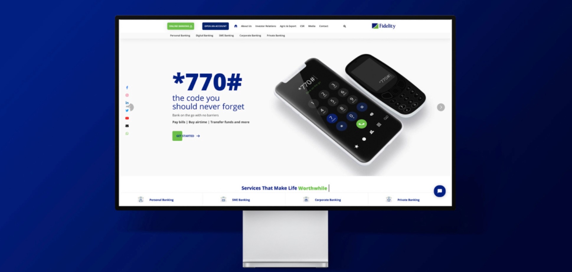
We developed a fully responsive website design that has not only gone to solve the problem of fragmentation but created a unique experience for users.

Quality Assurance was done to ensure a consistent approach across the over 100 pages on all device and browser. Using BrowserStack, we emulated the site on real devices. Knowing that our users were 73% in Chrome, 12% in Safari, 9% in Firefox, 4% in IE, and 1% in Edge, we prioritized fixes according to audience size and criticality.

After a successful launch the entire team was on standby to give support all round the year, we maintained the site structure, design and codes.

French

Cuit et haché par Ayodeji Osindele ©2023

💙FAIRE UN IMPACT AVEC LE DESIGN

Ayodeji

French

Cuit et haché par Ayodeji Osindele ©2023

💙FAIRE UN IMPACT AVEC LE DESIGN

Ayodeji

French

Cuit et haché par Ayodeji Osindele ©2023

💙FAIRE UN IMPACT AVEC LE DESIGN

Ayodeji

French

Cooked & Chopped by

Ayodeji Osindele ©2023

💙FAIRE UN IMPACT AVEC LE DESIGN

Ayodeji